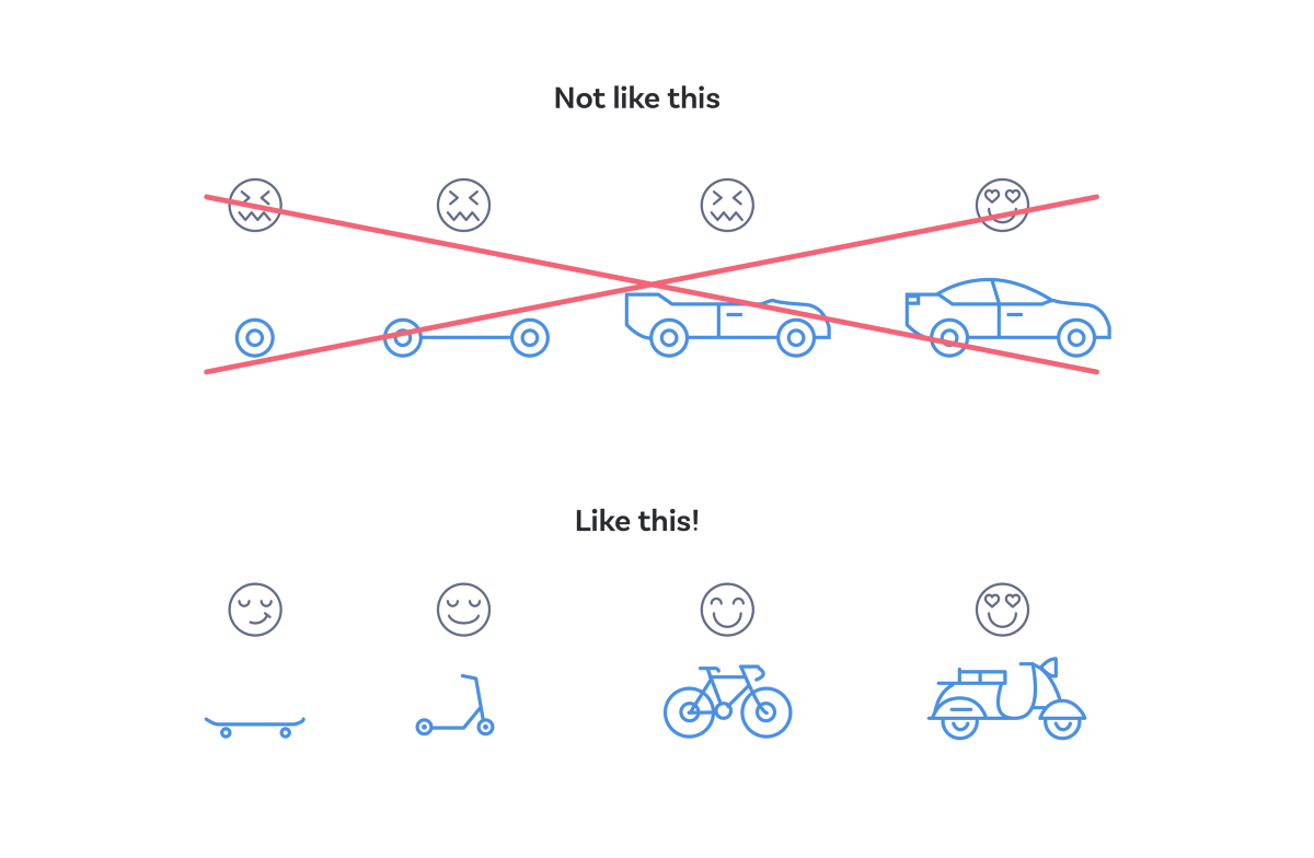
The above figure is often used to demonstrate a minimum viable product, but I think it can also be used to demonstrate a minimum viable experience. The skateboard may be a little slower, but it doesn’t stop the user getting to where they want to go. So, if the user’s browser doesn’t support JavaScript or modern CSS then it doesn’t break, it presents the default experience instead: a button which instructs the user to generate a report. The user will experience a very similar process, but has to perform one extra click.
The beauty of this approach is that the site doesn’t ever appear broken and the user won’t even be aware that they are getting the ‘default’ experience. With progressive enhancement, every user has their own experience of the site, rather than an experience that the designers and developers demand of them.