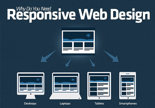
Bootstrap Media queries (key breakpoints in Bootstrap grid system):
/* Extra small devices (phones, less than 768px) */

@media (max-width: 767px) {

}


/* Small devices (tablets, more than 768px and less than 992px) */

@media (min-width: 768px) and (max-width: 991px) {

}


/* Medium devices (desktops, more than 992px and less than 1200px) */

@media (min-width: 992px) and (max-width: 1199px) {

}


/* Large devices (large desktops, 1200px and up) */

@media (min-width: 1200px) {

}


@media (min-width: 768px) {

	.container {

		width: 750px;

	}

}

@media (min-width: 992px) {

	.container {

		width: 970px;

	}

}

@media (min-width: 1200px) {

	.container {

		width: 1170px;

	}

}
Paste the following lines within the [head] and [/head] tags on your html page. This will set the view on all screens at a 1×1 aspect ratio and remove the default functionality from iPhones and other smartphone browsers which render websites at full-view and allow users to zoom into the layout by pinching.
<meta name="viewport" content="width=device-width,initial-scale=1,maximum-scale=1,user-scalable=no">

<meta http-equiv="X-UA-Compatible" content="IE=edge,chrome=1">

<meta name="HandheldFriendly" content="true">
This css code will hide sidebar if your browser width is lower than 480px or if your device width is lower than 480px:
@media screen and (max-width: 480px), screen and (max-device-width: 480px) {

	.sidebar {display:none;}

}
Or import css styles with same conditions:
@import url("narrow.css") screen and (max-width: 480px), screen and (max-device-width: 480px);
Or add css file into document with same conditions:
<link href="narrow.css" media="screen and (max-width: 480px), screen and (max-device-width: 480px)" rel="stylesheet" />
Or add css file into document with width range:
<link href="medium.css" media="screen and (min-width: 701px) and (max-width: 900px)" rel="stylesheet" />
height, width, min-width, max-width, min-height, max-height - is the width or height of the target display area, e.g. the browser.
device-width, device-height, min-device-width, max-device-width, min-device-height, max-device-height - is the width or height of the device's entire rendering area, i.e. the actual device screen.
Combinations with width:
@media screen (min-device-width: 320px) and (max-device-width: 480px), screen (min-width: 320px) and (max-width: 480px) { ... }
Other parameters:
@media screen and (orientation:portrait) { ... }

@media screen and (orientation:landscape) { ... }

@media screen and (device-aspect-ratio: 16/9) { ... }

@media screen and (color) { /* Screen is in color */ }

@media screen and (min-color-index: 256) { /* Screen has at least 256 colors */ }

@media screen and (monochrome) { /* Screen is monochrome */ }

@media screen and (resolution: 163dpi) { ... }
Media Types:
| Media Type | Description |
|---|---|
| all |
Used for all media type devices |
| aural |
Used for speech and sound synthesizers |
| braille |
Used for braille tactile feedback devices |
| embossed |
Used for paged braille printers |
| handheld |
Used for small or handheld devices |
|
Used for printers |
|
| projection |
Used for projected presentations, like slides |
| screen |
Used for computer screens |
| tty |
Used for media using a fixed-pitch character grid, like teletypes and terminals |
| tv |
Used for television-type devices |
This code is using css3 media queries. This is good for creating mobile version of your site for comfortable viewing it on iPhone or Android. Also this is good for creating different styles depending on the screen width.
Responsive Media
img { max-width: 100%; }
I agree with your this article. Actually css3 is awesome.
I completely agree with your article. It’s possible to know about it and it will snow me good ways of this topic. This is very nice post! I will bookmark this blog.
CSS3 is realy great.