The periodic cicadas spend most of their lives as underground nymphs, emerging only after 13 or 17 years. The unusual duration and timing of their emergence may reduce the number of cicadas lost to predation, both by making them a less reliably available prey (so that any predator who evolved to depend on cicadas for sustenance might starve waiting for their emergence), and by emerging in such huge numbers that they will satiate any remaining predators before losing enough of their number to threaten their survival as a species.
The Cicada Principle and Why It Matters to Web Designers
UPDATE: Check out the Cicada Project to see where our community has taken this idea!
I’m going to start off on a seemingly wild tangent today, but stick with me — I do have a purpose.
A few years ago, I read some interesting stuff on periodical cicadas. We generally don’t see a lot of these little guys as they spend the vast majority of their lives quietly tunnelling away underground and munching on tree roots.
However, depending on the species, every 7, 13, or 17 years these periodical cicadas simultaneously emerge en masse, transform into noisy, flying creatures, find a mate, and die not long after.
While this is a rather rock’n’roll ending for our nerdy cicada, it raises an obvious question: Is it just by chance that they adopted 7, 11, or 13-year life cycles, or are those numbers somehow special?
As it turns out, these numbers have something in common. They’re all prime numbers—numbers that can only be divided by themselves and 1 (that is,1, 2, 3, 5, 7, 11, 13, 17, 19, 23, and so on).
But why does that matter?
Research has shown that the population of creatures that eat cicadas — typically birds, spiders, wasps, fish and snakes — often have shorter 2 – 6 year cycles of boom and bust.
So, if our cicadas were to emerge, say, every 12 years, any predator that works in either 2, 3, 4 or 6 year cycles would be able to synchronize their boom years with this regular cicada feast. In fact, they’d probably name a public holiday after it called Cicada Day.
That’s not much fun if you’re a cicada.
On the other hand, if a brood of 17-year cicadas was unlucky enough to emerge during a bumper 3-year wasp season, it will be 51 years before that event occurs again. In the intervening years, our cicadas can happily emerge in their tens of thousands, completely overwhelm the local predator population, and be mostly left in peace.
Resourceful little guys, eh?
That’s great. But what has all this got to do with web design?
A few weeks ago we looked at the process of making seamless tiles. As super-useful as seamless tiles are, it can be tough to get the balance just right.
On one hand you want to keep the file dimensions as small as possible to take best advantage of the tiling effect. However, when you notice a distinctive feature — for instance, a knot in some woodgrain — repeating at regular intervals, it really breaks the illusion of organic randomness.
Maybe we borrow some ideas from cicadas to break that pattern?
Generating Organic Randomness with CSS
Example 1:
Enough talk. Here’s a quick proof-of-concept. This is not supposed to be visually splendid, but it does a good job of showing what’s going on. Keeping the ‘cicada principle’ in mind, I’ve made three square, semi-transparent PNGs of 29px, 37px, and 53px respectively, and set them up as multiple backgrounds on the HTML element of a test page.
![]() 29-a.png (2.0kb)
29-a.png (2.0kb) ![]() 37-a.png (1.7kb)
37-a.png (1.7kb) 53-a.png (2.5kb)
html { background-image: url(29-a.png),url(37-a.png), url(53-a.png); padding:0; margin:0; height: 100%; }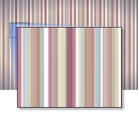
Less than 7kb of imagery generating a theoretical area of original texture of almost 57,000 pixels square
As you can see, the tiles overlap and interact to generate new patterns and colors. And as we’re using magical prime numbers, this pattern will not repeat for a long, long time.
Exactly how long? 29px × 37px × 53px… or 56,869px!
Now this was something of a revelation to me. I actually had to triple-check my calculations, but the math is rock solid. Remember these are tiny graphics — less than 7kb in total — yet they are generating an area of original texture of almost 57,000 pixels wide.
You can imagine what happens if you were to add in a fourth layer of tiling — let’s say a 43px tile. Or maybe you can’t imagine it, as the numbers start getting a little brutal and are liable to slap you about the ears if you stare at them too long.
Suffice to say, you’ll get a number more relevant to planet terraformation than web design.
Ok. So, abstract, geometric stripes are nice and all, but how else can you apply this idea?
Example 2
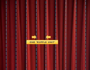
Coining a new measurement system — the ‘ruffle unit’
Let’s take a more photo-realistic example that we’ve probably all seen at some point: the red velvet theatre curtain. I found a nice curtain graphic here to use as a start point. Looking at our curtain you can see it breaks into roughly equal vertical units.
For this example I’m going to refer to this distance as one ‘ruffle unit’, and (unlike the first example) it’s going to be more important than the strict pixel dimensions of the images we’re working with.
Firstly, I’m going to pick out one of these ruffles and convert it into a seamless tile. It’s a JPEG and it weighs in at a tidy 8kb.

One layer tiling curtain: Not exactly impressive
Rendered alone, this graphic is everything we don’t like about tiling backgrounds. While there are no obvious visible join, it’s very mechanical and wholly unconvincing.

A 3-unit-wide tile
For layer two, the prime number we’re going to use is three. I’m going to pick out a new section of curtain and place it inside a transparent PNG that is three ruffle units wide. I’ve feathered the right and left edges so it blends smoothly with the background. The resulting file comes in a tick under 15kb.

Two layers of tiling curtain — an improvement
When we overlay this tile on our bottom layer we certainly get an improved result. There’s still an unnaturally regular pattern apparent, but it’s starting to break down a little.
The magic number for our third layer is seven.
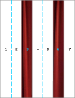
Our third layer is a 7-unit-wide tile
We’re creating a new transparent PNG seven ruffle units wide, and I’m going to drop in two new sections of ruffle image at positions 3 and 6. If that sounds confusing, the diagram to the left *should* clear things up a bit. Again, I’ve feathered the edges on this image to help it blend with the lower layers.
Obviously this is a larger image in both pixel dimension and file size, but it still only tips the scale at around 32kb — not outrageous by any measure.

The final result
Here’s what happens when we tile this graphic over the first two layers. I’m pretty happy with that result. True, your eye can pick out small sections of image that seem to repeat (because they do), but the underlying pattern becomes so complicated that your eyes stops searching for the similarities.
To look at it another way, if we treat each ruffle purely as a number, the number pattern it produces looks like this: 1, 2, 3, 1, 2, 6, 1, 2, 1, 3, 2, 1, 6, 2, 1, 1, 3, 1, 1, 6, 1, 1, 2, 3,..
There is a pattern there but it’s very difficult to discern.
In this example, a practically endless curtain background has cost us a grand total of just 53kb. And of course, it would be relatively trivial to add a fourth layer — perhaps using 11 units — if we wanted to. However, I’m not convinced that’s warranted here.
Also bear this in mind: This example uses the one of the simplest possible sets of prime number — 1, 3, and 7. If we were to use, let’s say, 11, 13, and 17, we could build in much more complex variation for a given distance. It really just comes down to the scale of the curtain we choose versus the screen width.
Example 3
My last example is less about pure practical applications, and more about having some fun with primes. I’m not going to break down the theory again, as the core concept is the same as the first two examples, but you’re more than welcome to deconstruct it in FireBug.
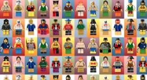
2,200 years ago Emperor Qin Shi Huang, constructed an 8,000 man terracotta army to guard his tomb. Each soldier, chariot and weapon is a one-off, hand-crafted creation.
Using simple CSS, prime numbers and handful of images, we’re going to raise our own mighty army. What it might lack in stature, it makes up for in sheer weight of numbers.
I give you… my Mighty Legion of Lego!
The legion is built from just eight images that mingle and weave together to produce thousands of permutations. It uses:
- 2 images for the background tiles
- 2 images for the legs
- 2 images for torsos
- 2 images for the heads
Summary
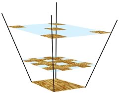
The stacking order model
You can afford to make the bottom layer quite small and repetitive as much of it gets overwritten by the layers above. In fact, it’s likely that only 20 – 40% will remain unobscured.
On the other hand, your upper-most layer should always have the largest image dimensions but also the most thinly-scattered imagery, as these image elements will never be blocked out by other layers. It’s also probably best not to include highly-distinctive, eye-catching detail on your uppermost layer. Keep it scarce and generic.
Either way, some trial and error is almost always required.
Browser Support
I’ve kept the markup simple by applying multiple backgrounds to the HTML element. This is supported by all the current main browsers (Firefox 4, Chrome 10, IE9, Opera 11, Safari 5) but obviously not all older versions.
However if backward compatibility is a prerequisite, tiling the html, body and perhaps a single container div element might be a viable option. While the container element might be non-semantic, it’s potentially giving you huge sitewide value for a small concession. That’s your call.
These three examples are the first ideas that came to my mind, but I’m sure there are some much cleverer takes on the idea. Perhaps:
- An endless cityscape
- Nonrepeating woodgrain
- Star fields
- Densely layered jungle
- Cloudscapes
If you come up with a nice take on it, I’d loved to see it.
Related posts:
Links:

