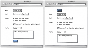
If the submit button at the top:
- the button is always at the same place;
- there is no need to scroll if the form is too long and changes were made at the top of the form
Stackoverflow question and answer.
For example user have Options page with long form in it. The most popular options are often on the top of the form, so user is changing them and have to scroll to the bottom of the form to hit "Submit" button. Imagine if user have to change something often and each time user should scroll to the bottom of the page to submit the form. IMHO it would be better for users to put "Submit" button above the form and they would scroll less. Example for testing two different types of forms on jsfiddle.
Sometimes long forms are splitted into tabs for making the form easier to use. But still it would be better to place "Submit" button above the tabs, because the height of tabs are different and the position on "Submit" button will not be the same.
Advantages of placing "Submit" button on the top:
- "Submit" button is always on the same place no matter of how long form is
- if the most frequently used options of the form are placed on the top part of form (as it should be) than in most cases "Submit" button will be visible for user without the scroll
Is there any disadvantages in placing "Submit" button on the top of the long form?
Possible compromise: maybe it would be good for users to put two "Submit" buttons in the long forms (one on the top of the form, another - at the bottom).
P.S. In the login or registration or survey forms "Submit" button should be in the bottom of the form because user will fill the text-inputs one-by-one and in the end user will hit "Submit" button. It would not be useful to place "Submit" button on the top of the form in these (or similar) cases.
Answer
Expanding on my comment, a possibility is to simply use a floating header/footer submit button. This way the submit button is always visible and can easily be accessed regardless of one's position on the form.
This has a potential to be confusing though; it should be clear that you can't just press the submit button whenever (unless you can, of course). Instead you should use some inline validation to show what's missing on the form. A possibility is scrolling to the error on the form when clicking the submit button (since it might not be on screen) but I'd want to test that. Automatically moving the user's scroll position is rarely desired.
Consider the linearity of your form as well; a floating submit button would be best if your form is:
- Multiple, scrollable pages in length
- Either doesn't have a definite ending point or invites editing multiple parts of the form out of order
- Often accessed to edit previously completed forms.
I can see this pattern being especially effective if the form were something like customer information where I might repeatedly need to access and edit an already filled out form. This becomes more like editing a document in Google Documents; Submit is now an easily accessible Save feature more than a final note on a sequential form.
